Signac.
Artist Paul Signac creates paintings that resemble cubism in the way that he uses squares to create his painting.
I saw this piece of art at a gallery in Sete, France called 'Musee Paul Valery,' I visited this gallery when I was on holiday there.
This piece was one of my favourites out of the gallery, I loved the colours that he used and how he actually created the painting with dabs of paint creating squares.
Thursday, 29 August 2013
Mia Pearlman
Mia Pearlman.
http://miapearlman.com/NewMuseum.htm
Above is a link to a time lapse video by Pearlman and her art work. Influences from this site would be to project a video of my work progressing onto the walls/my area. Depending on what my final project will consist of depends on what would be put into the video which will reflect on my work and the influences/inspirations behind it.
Cornelia Parker & Sarah Sze.
Cornelia Parker:
Cold Dark Matter an Exploded View.
This body of work by Cornelia Parker shows negative space perfectly. This work is similar to Sarah Sze work (image below) as she also hangs objects off of different things and using different materials to do so.
For our Art Foundation taster day we looked at a number of different images of Sze's then worked together to create a similar setting. We had different materials such as wool, bolts, wire etc to create a Sze's style piece. I chose to put bolts onto fishing wire which I then attached to a piece someone else had created. As there was many of us working on this piece you could see it growing and transforming in front of you. This would be something I would like to experiment and try again covering spaces with different materials and focusing on the negative spaces between them, creating drawings and photographs from the creation and experimenting with different screen printing etc that could link in with the work that I have created.
The image above to the right is of the little creation we created as a group on our taster day in the style of Sarah Sze.
Andy Goldsworthy
Andy Goldsworthy.
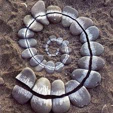
Goldsworthy is an artist that I love, using natural materials to create beautiful images. His images are all about nature and putting things together to create something new. These 4 images I have selected are some of my favourites as they show different materials that he has used along with different colours he has meshed together, incorporating the use of reflections also. (above)
I would love to create my own natural images using different materials that I gather, resulting in these visually pleasing photographs. Goldsworthy's work includes both art and photograph which is a big influence on myself as I wish to incorporate both art forms together when it comes to developing/experimenting with different ideas for my own project.
Dan Mountford - Double Exposure
Dan Mountford.
I love double exposure images and would love to incorporate this into my own work/project. Using double exposure can create very intricate and interesting photographs, using numerous layers of photo adds to the visual look of the final piece. I am inspired by Mountfords double exposures as not only does he just simply put an image over the previous one (top image) he also uses two images double exposed over one another to create a more detailed interesting photograph to view. Using this technique gives you the choice to portray two meanings/things within the one photograph.
Charlie Adlard and Tony Moore
Charlie Adlard and Tony Moore.
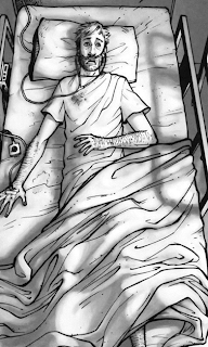
Similar to Ansel Adams photographs, these drawings are black and white which adds to the aesthetics of the images and the comic book as a whole. Below are two drawings one the original black and white the other a rare colour drawing.


Black and White vs Colour.
Ansel Adams
Ansel Adams.
Landscape is probably my favourite genre to work in, Adam' work is an influence of mine as I love how he has managed to capture the different scenes despite the somewhat dismal looking weather. His perfect composition and the black and white editing creates beautiful images that I wish to take inspiration from.
Subscribe to:
Comments (Atom)


