
Saturday, 2 November 2013
My Space.
Book Project.

 We were given a project to create our own book based upon an art book and novel. I based mine on a photography book based on light paintings and a novel called 'The Crumple Zone.' I decided to take my own photographs to be the main part of my book. Setting my camera to a long shutter speed resulted in my own light paintings. I printed three copies of the same image, one on acetate, paper and used the cello tape effect on the last copy. This is the order I decided to put my images into the book. After the three images I incorporated images out of the photography book I based it on. To incorporate the novel I selected specific sentences/words that reflect my photographs. I then stuck these on top of the paper copies of my photos. To put the pages altogether I used a hole punch to create holes in each page then used bolts to bind it together.
These photographs to the left are a few selected pages from my
book. The image at the bottom of this section shows the front and back pages of my book, which are made out of cello tape.


Improvement Drawings.

 Above is a quick sketch I did at the beginning of the course from a still life installation. To improve the piece I covered it with a wash of black ink then drew the still life over the top again with white charcoal. To create the look of the wool strung up on the table I used actually wool so you could get the visual and physical look of it.
 To the right is a sketch I created in the style of artist Kurt Jackson. I stood outside and did some life sketches of bushes/trees and people standing in between. To improve my drawing covered the bushes and trees with white emulsion and waited for it to dry. I then used a paper towel to wipe black ink over the emulsion which created a scratched into effect because of the way the emulsion dried. I used newspaper to collage the bottom of the page then used a slightly wet sponge to drag some of the ink across the page which resulted in the light gray look to the top and bottom of the page.
Negative Space Work.
 This piece was from my first day of Art Foundation. We were focusing on negative space from a still life installation. I created the lines using pencil then added a collage of newspaper around the edges of the lines focusing on the space between the objects 'negative space.'
 Large Still Life Pieces.
We were set a task to create 15 still life paintings in our sketchbooks and 5-10 big pieces. Working in a similar way to artist Ben Nicolson here are a few of my larger pieces.


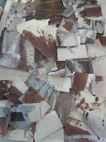
The top left painting I did was one of my first ones, I created squares of paint similar to what Ben Nicolson did. I then painted from the still life over the top of the paint and splattered ink onto it. I wanted to do something different with this piece so I cut it up into similar sized pieces. I then picked out my favourite sections of the painting and photocopied them so they were bigger. After this I stuck the little pieces and the photocopied sections all together mix matched and added bits of cardboard that I worked into with a scalpel. To the left is my final piece which I think went quite well.

This is the first painting that I did. For the background I tea stained some paper then started off with gray acrylic painting the still life installation. I then used brown acrylic and black ink to draw different parts of the still life over the top. This then created different layers to the painting which consists of thick line drawings.

With this painting I stuck with a colour palette of black and white. I used white emulsion for the background and created squares of colour with black ink and emulsion. Then I created line drawings from the still life, using white emulsion over the black squares then ink over the white emulsion. I used black ink to outline the whole drawing. This created a negative look to the paintings, using opposite colours that work together.
Thursday, 12 September 2013
Studio Space.

This is my studio space at college. I am currently working on it to make it more busy and personal to me, so it will eventually be a calm place to work in.
Wednesday, 11 September 2013
Drawings.
Here is a drawing I created from an installation we set up. I drew 3 drawings one ontop of the other creating different layers and using different mediums. I used Charcoal, Pastel and Ink.

Subscribe to:
Comments (Atom)