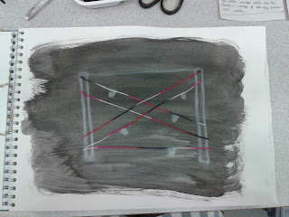
Above is a quick sketch I did at the beginning of the course from a still life installation. To improve the piece I covered it with a wash of black ink then drew the still life over the top again with white charcoal. To create the look of the wool strung up on the table I used actually wool so you could get the visual and physical look of it.

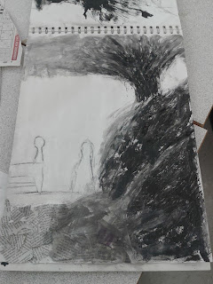
To the right is a sketch I created in the style of artist Kurt Jackson. I stood outside and did some life sketches of bushes/trees and people standing in between. To improve my drawing covered the bushes and trees with white emulsion and waited for it to dry. I then used a paper towel to wipe black ink over the emulsion which created a scratched into effect because of the way the emulsion dried. I used newspaper to collage the bottom of the page then used a slightly wet sponge to drag some of the ink across the page which resulted in the light gray look to the top and bottom of the page.
 Above is a quick sketch I did at the beginning of the course from a still life installation. To improve the piece I covered it with a wash of black ink then drew the still life over the top again with white charcoal. To create the look of the wool strung up on the table I used actually wool so you could get the visual and physical look of it.
  To the right is a sketch I created in the style of artist Kurt Jackson. I stood outside and did some life sketches of bushes/trees and people standing in between. To improve my drawing covered the bushes and trees with white emulsion and waited for it to dry. I then used a paper towel to wipe black ink over the emulsion which created a scratched into effect because of the way the emulsion dried. I used newspaper to collage the bottom of the page then used a slightly wet sponge to drag some of the ink across the page which resulted in the light gray look to the top and bottom of the page.


No comments:
Post a Comment